colophon
A portfolio that claims attention to detail and then hides the details is asking to be taken on faith. So here is every decision on this site, including the ones that are arguable.
01 · The mark


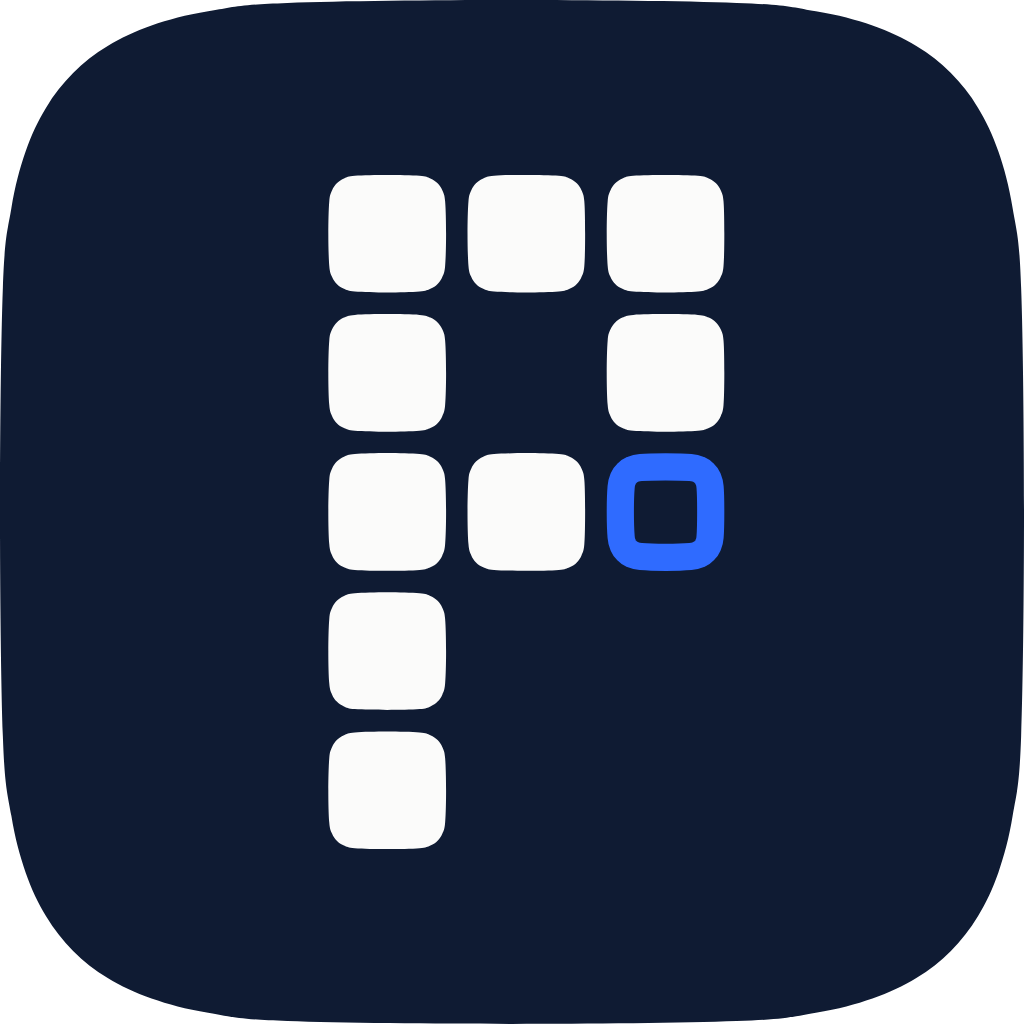
A P set on the shelf
The mark is a P built from the same squircle tiles as the product shelf on the home page. Every filled tile is something shipped. One slot is open, in blue, for the next one, and it sits where the bowl closes back to the stem: the last piece.
It is the third attempt. The first was a damped spring plotted from y(t) = A·e^(−ζωt)·cos(ω_d·t), which had an idea and could not be read: a stray “w” at 96px, lint at 16. The second was a plain P, which could be read and had no idea at all. A mark has to do both before it does anything else.
A grid mark cannot simply be scaled down, so it is drawn twice. The display cut uses squircle tiles and draws the open slot as an outline. The small cut is drawn on a real 16×16 pixel grid, 2px tiles and 1px gaps on whole pixels, so every gap stays open in a browser tab. A 2px square cannot carry an outline, so there the open slot becomes a single blue pixel.
Both are generated by scripts/mark.mjs, not drawn, so the letter is a five-line grid anyone can read in the source.
02 · The icon shape
n = 2 · ellipse
n = 4.5 · used here
n = 12 · near-square
Every tile on this site is clipped to a superellipse, |x|ⁿ + |y|ⁿ = 1, not a rounded rectangle. A rounded rectangle joins a straight edge to a circular arc, and curvature jumps at the seam. The eye reads that discontinuity as a faintly pinched corner without being able to name it. A superellipse has continuous curvature the whole way round.
The path is sampled from the equation rather than copied from the bezier constants that circulate for this, so it is checkable: every point satisfies the equation to within floating-point error, and 32 samples land within ~1.1px of the true curve on a 1024px icon.
03 · Type
| Role | Face | Tracking and leading |
|---|---|---|
| Headings | Inter 600, section H2 550 | −0.032em tracking, 1.04 leading; 68px hero H1, 56px page H1, 40px H2 |
| Body + UI | Geist 400–600 | −0.003em tracking, 1.68 leading, 65ch measure |
| Code + labels | Geist Mono 400–500 | +0.1em tracking, uppercase, 11px for labels |
| Figures | Literata 500, italic for asides | lining tabular numerals; the signal row and pull quotes only |
Tracking is size-specific. Large type reads too loose without negative tracking; small type needs a little positive. One letter-spacing value across a whole site is wrong somewhere by definition.
Lowercase is a voice, applied to display headings and UI labels. It is deliberately not a text-transform on *, which lowercases NFPA and iOS too, and the result reads as a bug rather than a choice.
04 · Motion
Easing
--ease-out
cubic-bezier(0.23, 1, 0.32, 1)
Anything entering or responding to a press
--ease-in-out
cubic-bezier(0.77, 0, 0.175, 1)
Anything moving across the screen
--ease-drawer
cubic-bezier(0.32, 0.72, 0, 1)
Sheets, when a spring would be overkill
Duration
--dur-fast 120ms
Press feedback, hover colour
--dur 180ms
Tooltips, small popovers
--dur-slow 260ms
Thumbs, dropdowns, card lift
Nothing on this site uses ease-in. It starts slow, which delays movement at the exact moment the user is watching hardest. A 300ms ease-in dropdown feels slower than a 300ms ease-out one.
The command menu has no open animation at all. It is opened by keyboard shortcut, so it gets used tens of times by anyone who finds it, and an entrance is a tax charged on every use.
05 · Dependencies
There is no animation library here. All 14 components in the library run on CSS transitions, Pointer Events, and one small spring built on requestAnimationFrame.
That is not minimalism for its own sake. CSS transitions run off the main thread, so they hold up while the browser is busy parsing a route, which is precisely when a Framer Motion animation driven by requestAnimationFrame starts dropping frames. The spring exists only where a gesture has to be interruptible and carry velocity, which is the one thing CSS genuinely cannot do.
- next
- react
- tailwindcss
- lucide-react
- clsx
- tailwind-merge
06 · Accessibility
prefers-reduced-motion
Travel and springs drop out; opacity and colour stay, because they carry meaning. Reduced motion means gentler, not absent.
prefers-reduced-transparency
Translucent chrome becomes solid rather than merely less blurred.
prefers-contrast: more
Borders promote to the strong token and muted text promotes to full contrast.
Focus
Never removed, only replaced: a 2px accent ring with offset, on :focus-visible so pointer users never see it.
Colour
No status is carried by colour alone; every dot has a label beside it.
Headings
One h1 per page, no skipped levels. The previous site used h1 for all twenty-odd headings.
07 · Brand assets
The social banners are generated from this codebase rather than exported from a design tool, so they cannot drift from the tokens and they can be regenerated after any change. The product icons sit on the mark's own damped curve, and the layout keeps the message clear of the avatar crop on both platforms.



Disagree with any of it? I would genuinely like to hear why. madhvaniparth2@gmail.com.